Cimzia Patient UX
From spark to relief
The Problem
Patients are in the dark.
Patients prescribed Cimzia waited two weeks in the dark while an opaque fulfillment system ground away behind the scenes. No updates, no timeline, no idea what happens next, and 43% of them gave up and chose another treatment.
That's not a UX problem. That's a person, scared, hearing nothing.
Research
Uncovering the darkness.
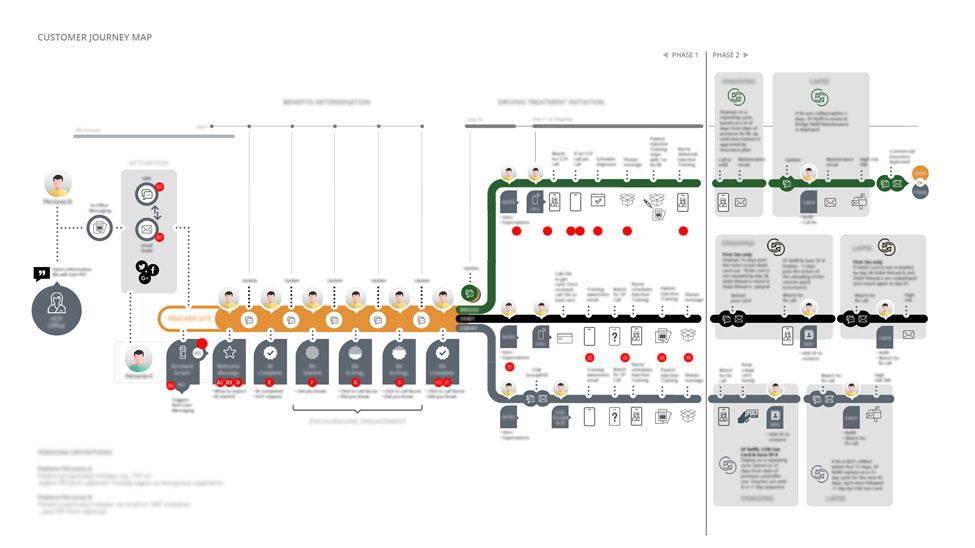
We interviewed patients, doctors, and caregivers to understand the gaps in the program. Discovery uncovered the timeline patients endure and the gaps in knowledge. The client and team identified three major patient segments based on insurance availability and color-coded each along a timeline of events between diagnosis and second treatment.
Insight: two weeks in the dark on when patients would be updated on receiving the medication. The complexity of the inputs and data sources needed to be shielded from the end users.
The Solution
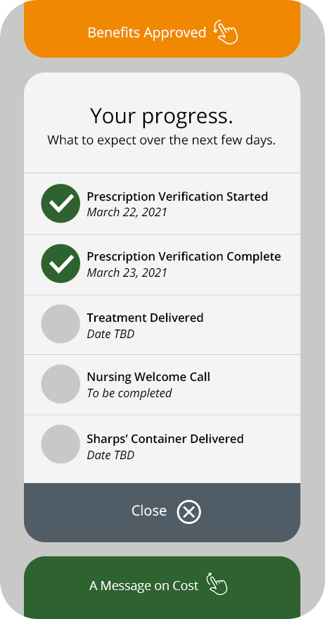
A progress tracker, not a portal.
Through brainstorming and team workshops, we landed on a "pizza tracker" metaphor that patients could access to stay informed. The tonality of "assistant" came up in several sessions.
Once the data sources were mapped to timelines relative to the doctor's recommendation, we created messages for each identified touchpoint. The number of touchpoints was making the pizza tracker metaphor too cumbersome, driving us toward simplicity.
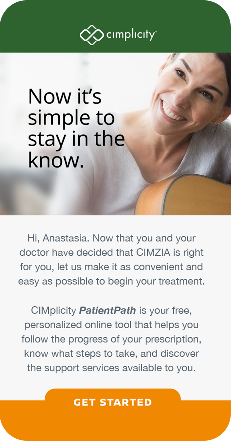
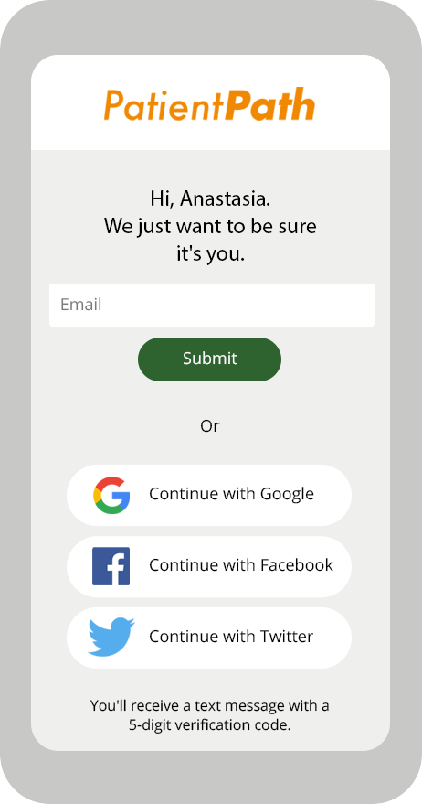
We identified three communication paths to get patients activated on the app. A navigation-less web application that presents the most recent information the moment patients refresh their browser. No passwords, no menus. Just open it and see exactly where your treatment stands.
Wireframes & Prototype
From low-fidelity to approved.
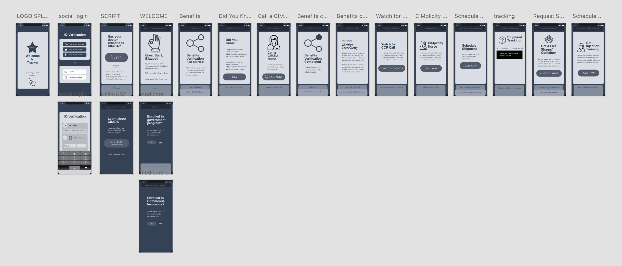
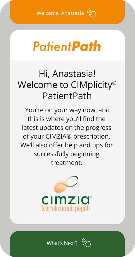
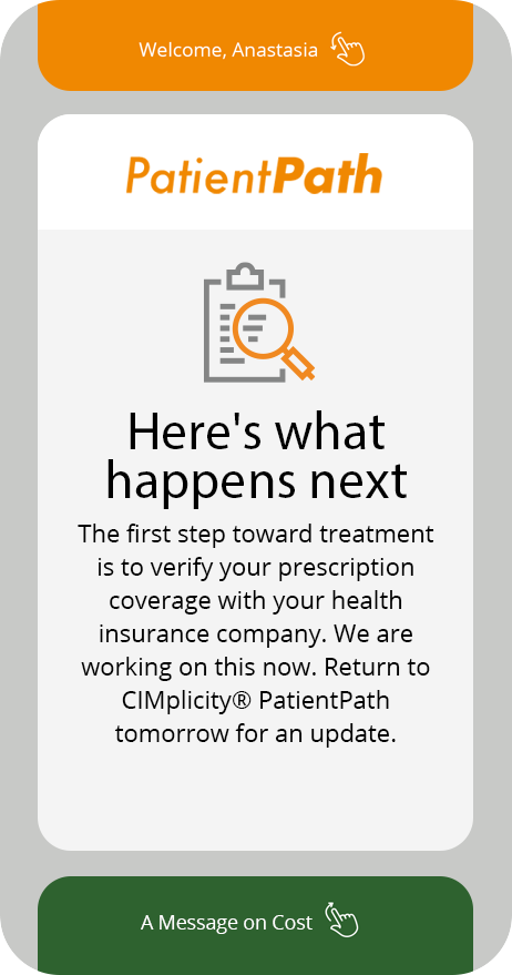
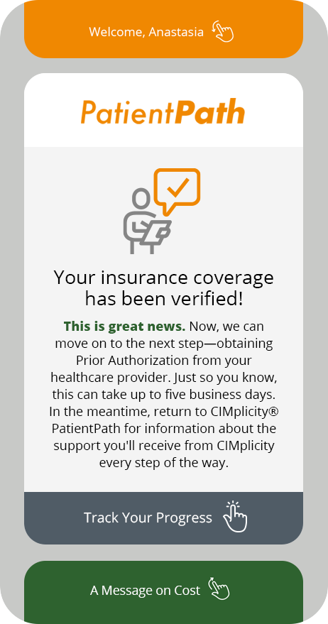
We worked closely with users to prototype the user flows and make interactive modifications based on feedback. Passwordless verification kept the simplification promise. Iconography provided visual cues across stages of the program.
Final UI
Every screen earns its place.
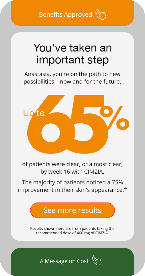
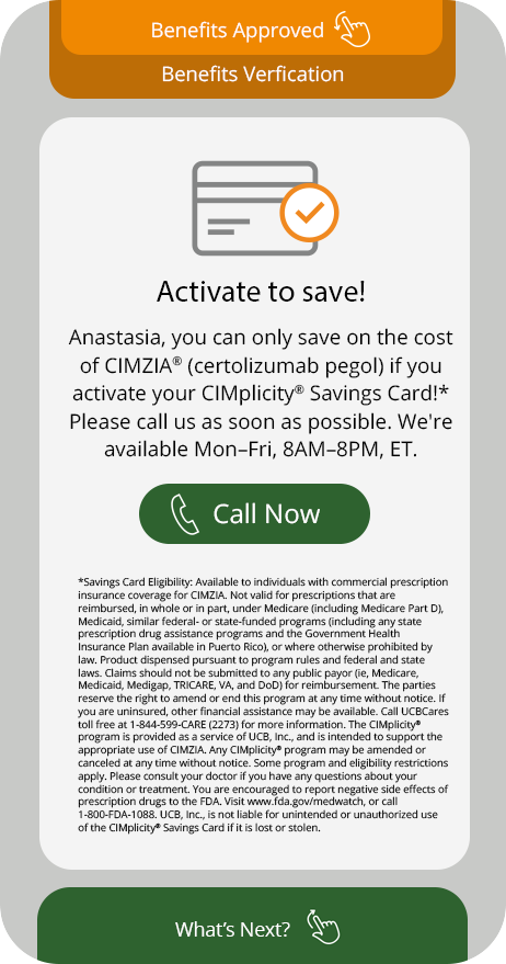
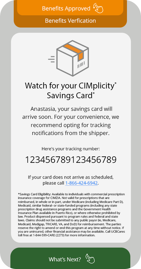
A navigation-less experience designed around one question: what does the patient need to know right now? Each screen surfaces the most relevant update the moment patients return, from onboarding through benefits verification to shipment tracking.
Iconography
A custom icon suite to make a clinical process feel human.
Each icon was designed to provide visual cues and facilitate quick comprehension across the stages of the program. The consistent gray-and-orange palette carried the CIMplicity brand while keeping the interface warm and approachable.




Outcome
27%
Reduction in prefill drop-off, year one.
Next Project
Honda Brand & CRM →